
Color, initially underestimated, unexplored, and treated casually on the photographic journey. However, with the development and the desire to create beautiful, stunning photos, the subject of color returns like a boomerang. At some point in our photography adventure, we realize that it is one of the most important factors influencing the final outcome of our photos. In my opinion, the sooner we understand this, the sooner we will start to succeed in creating exceptional photographs. Color is a wonderful medium that allows us to enter a magical world and tell a story that a conscious viewer will understand in every corner of the world. Each color not only symbolizes certain emotions (behaviors), such as anger, joy, happiness, and health, but also, through combination with another color, can convey specific symbolism, such as the fight of good against evil (white and black).
Before we discuss and illustrate photos from the perspective of color theory, let’s start with a dose of inspiration and get to know 10 great artists who have a deep awareness and sense of aesthetics in terms of the color scheme of their works. I sincerely encourage you to browse through the portfolios of these individuals before proceeding further.
- Natalia Taffarel
- Lindsay Adler
- Tyler Shields
- Eugenio Recuenco
- David La Chapelle
- Kristian Schuller
- Edward Hopper
- Jingna Zhang
- Tim Walker
- Marcin Kempski
It’s quite easy to notice that the works of the above artists attach great importance to colors. There are no random color combinations in their photos; everything is well thought out and executed in harmony with the color palette. Natalia Taffarel’s words during one of her interviews stuck with me (in my opinion, she is one of the best retouchers in the world): “- If you look at bad photography, your subconscious mind will tend to produce low-quality photos. If you take inspiration from beautiful art and color schemes, you will strive for that yourself.” It’s worth asking yourself – where are you now and where do you want to be.

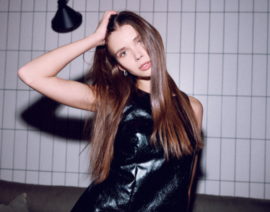
model: Aleksandra Dobek, analog color scheme
Let’s start from the beginning then. What should we know and what equipment is good to have to manage color in studio photography? First of all, we need to have an idea for the photos we want to create. Today, I would like to present to you an idea that I realized during a live broadcast “In the Light of Inspiration,” which you can see on my YouTube channel. The inspiration for the photo shoot was the Adidas x Gucci collaboration, which you can see here: https://www.vogue.pl/a/adidas-x-gucci-wspolna-kolekcja.
You saw how wonderfully the color scheme of the clothes was combined with the lighting. The idea was to have the model dressed in similar colors to the background on which they are placed. I knew that in the photo studio, I had a cardboard background in a flesh color, so the clothing also had to be in similar hues. Such a combination is called monochromatic color harmony. If at this stage of your photographic journey you still don’t know how to combine colors and what goes with what – don’t worry, we have help from the free ADOBE CAPTURE app on IOS and ANDROID or the ADOBE COLOR website. In the app, you will see how specific colors are positioned on the color wheel (you will see some examples later on). You can also take a photo, for example, of an outfit, and see if the pants match the shirt, and if the entire outfit goes well with the background or the interior of the apartment. This is a fantastic solution, which I almost always start working on the color of a photo session with. Be sure to try it out.

“DUNE” Aleksandra Dobek and Aleksandra Dębska, analog color scheme
LIGHTING – SETUP 1
The entire lighting concept was born during the process of selecting the model and searching for styling. I wanted to achieve a commercial, high-contrast image, reminiscent of TV commercials and the above inspiration. The recipe is very simple:
- Two GlareOne Vega400 lamps
- 160 cm white umbrella from GlareOne
- GlareOne Easy Fold 60x90cm softbox
- GlareOne FatBoy Boom stands
I set up the lighting in a clamshell shape facing the model. I placed the umbrella above and slightly tilted it downwards as the main light source on a boom stand. This allowed me to have free space for shooting between myself and Konstantin. The 160cm umbrella allowed me to illuminate both the model and the background. I placed the second lamp with the 60x90cm softbox on the ground and directed it slightly upwards. A valuable tip – if you often use this lighting setup or plan to do so, consider the GlareOne Hightower Glide stand. It looks like the one in the picture below and works remarkably well.

Clamshell lighting is set up in proportions of 1:2 or 1:3 depending on the desired effect. The main light directed from above shines more intensely, while the lower light is set to a lower power and serves as fill light. GlareOne Vega 400 lamps maintain a color temperature of 5500k (daylight). This ensures that nothing will go wrong with the colors during, for example, a full-day photoshoot. Remember not to shoot on automatic white balance when working with flash lighting, as you may get different color tones each time. Therefore, set the white balance to flash or manually enter 5500K.


model: Konstantin Mazur, monochromatic color scheme
LIGHTING – SETUP 2
The second photo was also taken during a live stream and, of course, is also based on color harmony. This time, I wanted to showcase complementary colors – green and orange. However, I used a slightly different lighting setup for this:
- Two GlareOne Vega 400 lights
- Basic reflector
- GlareOne 150mm Kit spotlight
- Heavy Glide – GlareOne boom stand
My intention was to draw the viewer’s attention to the upper body and face of the model. First, I set up the main light, on which the spotlight (optical snoot) was attached, giving the circular effect. This is a superb tool for creative photography and playing with light.

Only in the second step did I add a fill flash with the basic reflector attached. The lamp was directed towards the ceiling so that the light would bounce off it and fall diffused. For me, this is one of the best setups for creating fill light, which is often overlooked by beginner photography enthusiasts. Here are the results of the second setup.

model: Marlena Ziobro, complementing the color scheme
LIGHTING – SETUP 3
This time, to create the lighting for this photo, I used LED lights from GlareOne instead of flashlights. LED lights have one enormous advantage: we can see in real-time how the light is distributed in our frame, and they maintain color temperature very well, which we can adjust.
- GlareOne LED 2000D BiColor light
- GlareOne LED 1500D light
- Basic reflector
- GlareOne 150mm Kit spotlight
- GlareOne 110×110 reflector – 5-in-1 reflector on a frame
Let’s move on to how the photo “Ukrainian girl” was created. The idea was to create the colors of the Ukrainian flag with a red heart on the model. In the studio, we had a yellow background at our disposal, so one of the colors was already covered, and there was quite a lot of it in the frame. The second important color is blue, of which there also had to be a lot. We set up the LED 2000D BiColor light with the basic reflector attached, onto which we applied two blue gels to enhance the color effect. Importantly, the lamp was set to 5500K. We then passed this lighting through a transparent 110x110cm reflector to diffuse the light further. Finally, we added the LED 1500D with a spotlight and a heart-shaped spot, as well as a red gel attached – included in the set. Both lights were placed close to the model. And that’s how the photo below was created.

model: Aleksandra Dębska, triad color scheme
Photos and color
Now see the photos I created in accordance with color theory using GlareOne Vega 400 flash lighting.


Color in a nutshell
As you have seen in the photos above, they are created using light and color. It is important that you become interested in color theory from now on and create your next photo sessions in accordance with its harmony.
You must also be aware when working with flash or LED lighting that by reducing or increasing the power of the lamps, we also have a significant impact on the color change in the photo. This is very important, because if we use it consciously, we can, for example, turn gray into 100% black or perfect white – of course in a well-darkened photo studio.
Colors are also divided into warm and cold
WARM:
Warm colors include red, orange and yellow and variations of these three colors. These are the colors of fire, autumn leaves and sunsets and sunrises, and are generally energizing, passionate and positive. Warm colors are not created by combining with a cool color. Use warm colors in your designs to reflect passion, happiness, enthusiasm and energy.
COLD:
Cool colors are green, blue and purple, and are often more subdued than warm ones. These are the colors of night, water, nature and are usually calming, relaxing and somewhat restrained. Blue is the only primary color in the cool spectrum, which means the other colors are created by combining blue with a warm color (yellow for green and red for purple). Use cool colors in your designs to convey a sense of calm or professionalism.
Also remember that there are neutral colors and we can combine them with all colors.
In summary:
- Hue is the color itself,
- Saturation refers to the intensity of the color,
- Brightness is the purity of the color (in high brightness, no black, white, or gray was added),
- Tones are created by adding gray to the color, making it more matte than the original,
- Shades are created by adding black or white to the color, making it darker or lighter than the original.
I hope that from today, color and light, which create the photo, will be a little closer to you, and you will use them in a more conscious way. If you want to succeed in your photographic journey, pay more attention to color and lighting setup when creating photo sessions. These two inseparable, interconnected elements together produce spectacular photographs. We’re rooting for you and looking forward to beautiful, refined photographs.

model: Danuta Tracz, complementing the color scheme
Piotr Werner – profile

With over 13 years of professional photography experience, Piotr Werner specializes in fashion and portrait photography, as well as advertising campaigns. He is an ambassador for brands like GlareOne, Calibrite, Voigtländer, TetherTools, and Newell. He also conducts photography workshops and individual training sessions. His work has been published in several renowned magazines worldwide. Piotr is the author of the photography handbook “In the Light of Inspiration,” published in 2021.
Read more articles
 https://glareone.eu/wp-content/uploads/2025/02/zwykly-apartament-niezwykle-zdjecia-miniaturka.png
300
382
Kamila Przyjemska
http://glareone.eu/wp-content/uploads/2024/04/logo-glareone.png
Kamila Przyjemska2025-02-14 09:48:082025-02-14 12:13:00Ordinary apartment, extraordinary photos – the battery flashes from GlareOne
https://glareone.eu/wp-content/uploads/2025/02/zwykly-apartament-niezwykle-zdjecia-miniaturka.png
300
382
Kamila Przyjemska
http://glareone.eu/wp-content/uploads/2024/04/logo-glareone.png
Kamila Przyjemska2025-02-14 09:48:082025-02-14 12:13:00Ordinary apartment, extraordinary photos – the battery flashes from GlareOne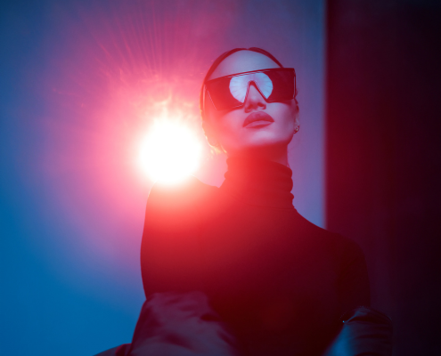 https://glareone.eu/wp-content/uploads/2024/05/miniatura-ostre-swiatlo-w-fotografii.png
400
495
marek
http://glareone.eu/wp-content/uploads/2024/04/logo-glareone.png
marek2024-05-27 07:49:362024-05-28 09:53:24Harsh light in photography – ideas for a creative portrait session using a spotlight
https://glareone.eu/wp-content/uploads/2024/05/miniatura-ostre-swiatlo-w-fotografii.png
400
495
marek
http://glareone.eu/wp-content/uploads/2024/04/logo-glareone.png
marek2024-05-27 07:49:362024-05-28 09:53:24Harsh light in photography – ideas for a creative portrait session using a spotlight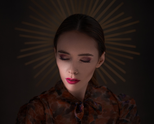 https://glareone.eu/wp-content/uploads/2024/05/miniatura-1-5.png
400
495
marek
http://glareone.eu/wp-content/uploads/2024/04/logo-glareone.png
marek2024-05-24 12:40:322024-07-11 10:11:18Color in photography. How to manage color to achieve success
https://glareone.eu/wp-content/uploads/2024/05/miniatura-1-5.png
400
495
marek
http://glareone.eu/wp-content/uploads/2024/04/logo-glareone.png
marek2024-05-24 12:40:322024-07-11 10:11:18Color in photography. How to manage color to achieve success